6 Pivotal Steps for Epic Product Images

You know that product images are pivotal to conversion and that 67% of online retail consumers make purchases based on images, but aside from using high resolution images you're not exactly sure how to get to the "next level" of visual assets.
The truth is that a retail site could have the most beautifully composed high resolution product shots possible and still fall short when it comes to conversion and customer engagement. That's why we've created this 6 step guide that goes beyond simply saying what you need and actually explains how to achieve it, including examples of online retailers who get it right.
Before panic sets in at the thought of adding one more thing to your already jam-packed day, consider this: every suggestion on this list is an image requirement you can pass along to your supplier, as long as you give them clear instructions and verbalize your expectations from day one.
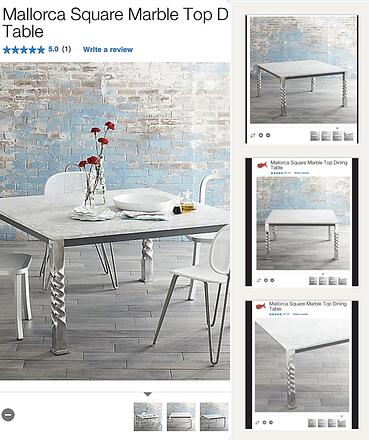
Multiple Product Shots from Different Angles
Consumers love the convenience of online shopping, but in order to counterbalance the tactile benefits of seeing a product in person, it’s imperative to offer pictures of products from multiple angles to ensure that customers get a cohesive mental picture. The images below are pulled from Crate and Barrel. Customers are given product perspective from mutple angles, and the feature image includes a shot of the table set with matching chairs. Doing this allows customers to envision the product as it could appear in their own home, and it simultaneously sells the Crate and Barrel "lifestyle" which would be impossible with a single flat shot.
Diversify Your Images
To assure customers that the product they’re purchasing is just as fantastic at home as it is on their screen, it’s crucial to include multiple types of product images including shots of the product in use - i.e. if you’re selling handbags, you’re going to have a much higher conversion rate if you include pictures of the bag being carried by a real live human being.
Using flat shot images to sell wearables is the ecommerce equivalent of using a skinny mirror in a brick and mortar store: they might buy it now, but there’s a good chance that when they bring it home they’re going to be unhappy with what they see. Returns kill the bottom line and customer loyalty: a customer who is forced to return their purchase is one who is unlikely to click “buy” in the future.
Shopbop is a fantastic example a retailer who gets it right - this luxury ecommerce giant was once simply known as “Bop”, a brick and mortar store based in Winsconson, but it’s not hard to see why they dominate the online shopping scene. Every product on the Shopbop site (and there are thousands) includes multiple flat shots and lifestyle images.
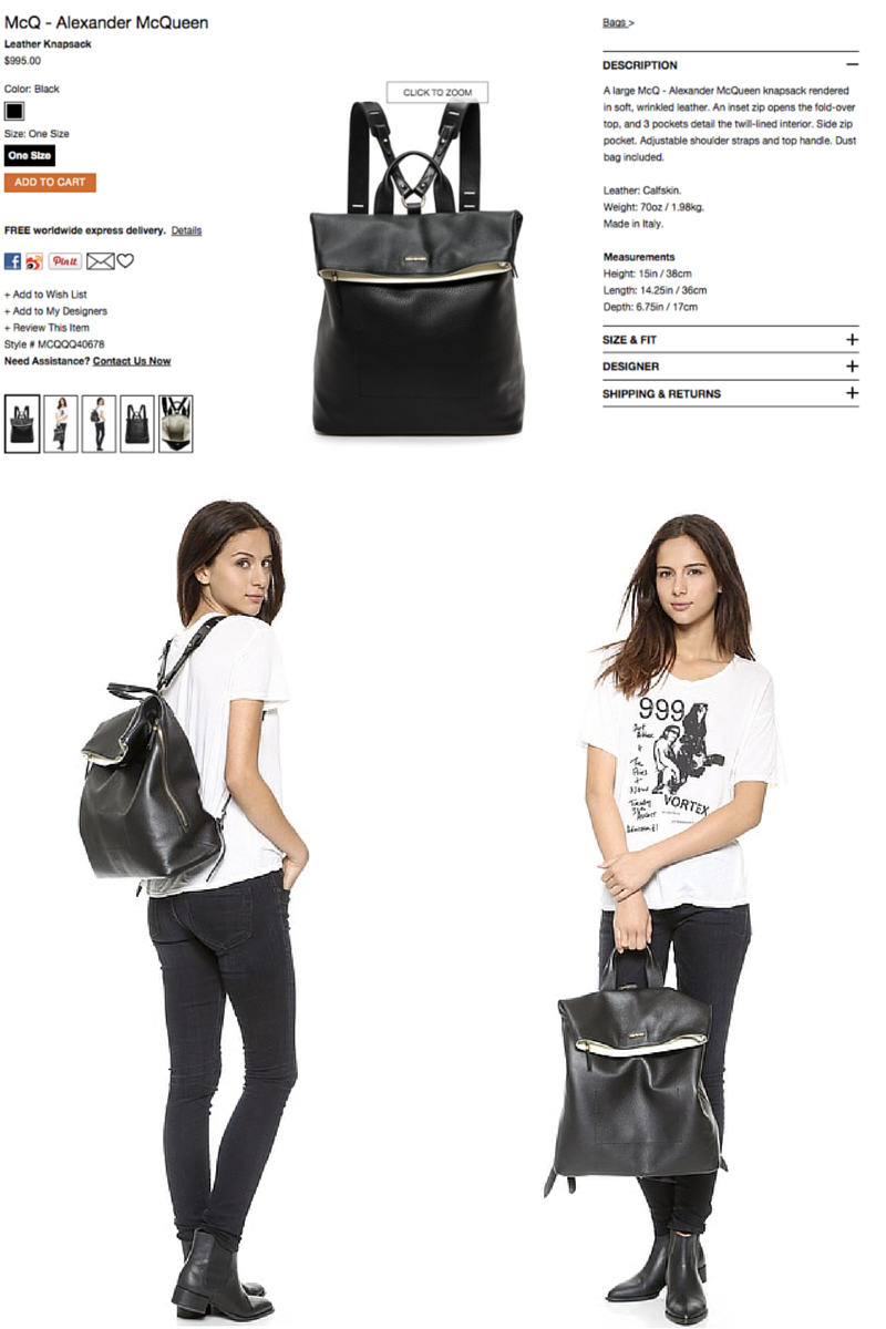
Include Visual Size References To Supplement Your Size Charts
Reading product dimensions is not a viable substitute for seeing a product in person - your customer is unlikely to whip out a tape measure, and additionally many consumers don’t trust their own instincts when it comes to size and fit, likely because there is a drastic lack of standardization of product content across different retail websites. If using a model in shot for size reference like the image above isn’t in line with the vision of your brand, adding another common item in the frame for size reference offers customers the added reassurance they need to purchase.
Quirky, a website that crowd-sources, produces, and sells ideas that are submitted for new inventions, does a great job of creating product images that include other standard sized objects, as seen in this picture of their “pickup power” charging device. By including an IPad and an Iphone in the product image, shoppers can immediately intuit the size of the product, which would be much more difficult if it was the only item pictured in the image.
This is a caption for this image
Embrace Consistency In Your Images
Yes, its important to have lots of different types of images, but its still critical to choose product shots that fit in with your site’s branding and maintain consistency in product presentation sitewide. Its tempting to try to keep things fresh, but including drastically diverse images can look sloppy and disjointed. Each product should be represented by photos that are uniform, including the number of images, the angles the product is shot from, the way each one is cropped, the background color of the photo, and what type of images (flatshot, lifestyle) you include. Uniform images give shoppers a clean, dependable customer experience which in turn builds brand loyalty.
Everlane has found great success as one of the first direct to consumer retail sites, but would it have enjoyed the same level of popularity without clean design and consistency within their product images? Doubtful.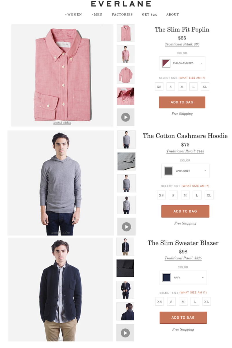.png)
Unique Clarifying Details Will Make Your Site Stand Out
My favorite ecommerce websites are the ones that give me a little something extra. Yes, that means sales or offers like free shipping, but it also encompasses something bigger and ultimately, more important.
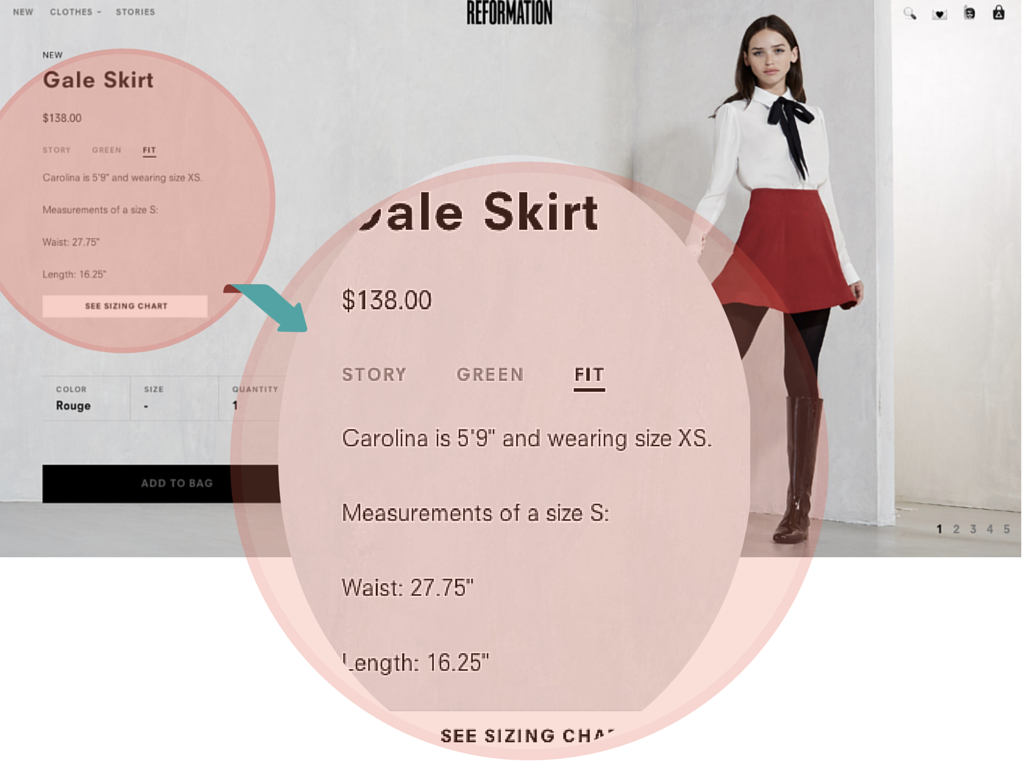
Once again the key objective is to outweigh the risks of shopping online (the convenience factor isn’t enough) through supplying unique references that will recreate the brick and mortar shopping experience. Reformation, a sustainable clothing brand, includes the height of their fit model as well as the size of the item they’re wearing to offer a more detailed shopping experience and eliminate some of the uncertainty of shopping online.
This additional product information takes the shopping experience from that skirt is a little short for me, I can't get it to that skirt looks a little short, but this model is 5’9” and I’m only 5’6 so it should fit perfectly.
It’s a small change, but it gives more depth to the images than they would have alone or with a size chart or dimensions for reference. The more interesting and unique details you can provide, the better, for both SEO practices and customer satisfaction.
Style Your Images to Embrace Niche Markets
It may feel scary to narrow your potential customer base, but according to a 2012 report by Adobe, repeat shoppers represent only 8% of all site visitors, but they account for nearly 41% of sales. In other words it’s more profitable to build a small loyal customer base of repeat shoppers than to appeal to everyone. On top of that, Ecommerce giants like Amazon have the market cornered on broad appeal; trying to beat them at their own game is a lost cause.
The better play is to go in the opposite direction and use every opportunity to appeal to that niche market - that includes the models you use, the visual styling, the background, and the camera angles. Each piece of the puzzle is another opportunity to build your brand and connect with your audience. Modcloth is a great example: though technically a straight sized website, the vintage inspired apparel site has gained many loyal customers due to an emphasis on body positive branding. By including a range of diversely shaped models, Modthcloth strengthens that branding and offers a refreshing change for customers who are frustrated by the universally accepted idea that models should be a size 0/2.
The Takeaway
It’s never been easier to set up an online store, which means that there have never been more available options for consumers to choose from. Use these 6 key steps to distinguish yourself from other retailers: by creating epic product images, you can offer your customers a shopping experience that offers as much, or more, product clarity as a brick and mortar shop.

Written by: Glori Blatt
Glori is a former buyer for an Ecommerce site and a compulsive online shopper using her experience to help retailers and suppliers improve their product content.
Recent Posts
Top Ecommerce Trends To Watch in 2025
Creative Real-World Examples of Zero-Party Data Collection From Brands and Retailers
Enter the Future of Shopping: The Age of the AI Shopping Assistant and Chatbot
Subscribe to the Below the Fold Newsletter
Standing out on the digital shelf starts with access to the latest industry content. Subscribe to Below the Fold, our monthly content newsletter, and join other commerce leaders.


.svg)