
The Complete Product Page Toolkit
Download this product page toolkit to get everything you need to create engaging, high-performing product pages that drive sales and build trust with shoppers.
DOWNLOAD TOOLKITLearn about the digital shelf, including strategies for winning sales.
How (and How Much) Will AI Change Shopping
Rob Gonzalez, Salsify co-founder & CMO, explains the shift to chat-based discovery and how brands can prepare.
Learn MorePIM
Manage all product content in one central system of record.
Syndication
Easily syndicate product content to every consumer touch point.
Enhanced Content
Enrich product pages with below-the-fold content and rich media.
Intelligence Suite
Bring AI-powered capabilities directly into your Salsify workflows.
Grocery Accelerator
Leverage the first-ever category-wide PXM accelerator in the grocery industry.
GDSN Data Pool
Synchronize standard supply chain, marketing, and ecommerce attributes globally.
Digital Shelf Analytics
Continuously optimize your organization’s product content syndication.
Catalog Sites
Share secure, on-brand, and always up-to-date digital product catalogs.
Automation and AI
Automate business processes and enhance Salsify workflows with AI.
PXM Platform, Integrations, and APIs
Integrate the PXM platform with the rest of your enterprise systems architecture.
Resources
Resource Library
Explore our ecommerce resources to get everything you need to win on the digital shelf.
Blog
Read our blog to get actionable insights for navigating changing markets and industry demands.
Webinars
Watch our on-demand ecommerce webinars to gain expert advice and tips from our community of industry leaders.
Customer Blog
Gain the latest tips, industry trends, and actionable ecommerce insights.
Knowledge Base
Investigate our knowledge base to build your Salsify skills and understanding.
API
Examine our comprehensive API and webhook guides to start working with Salsify quickly.

2026 Consumer Research
Our latest report shares shoppers' fresh insights on buying behavior, loyalty, AI trust, and more.
Download
For furniture and home goods brands, there are additional considerations that must be taken when setting up a product display page (PDP).
Consumers consider purchases within these categories to be high-involvement purchases, which means shoppers feel they must go through a multi-stage process to gather detailed information about each product.
This is why engaging product content is vital for furniture and home goods brands to increase conversion and give shoppers the information they seek online.
Explore some of the best product page examples from the furniture and home goods industry, and learn how to build pages and meet shoppers wherever they are on the digital shelf.
While shoppers looking for consumables like snack products or household cleaners may stop after reading a short product description, furniture and home goods shoppers have a long list of questions:
Problems with "bad" product content keep shoppers from completing sales, with many pointing to specifically to a lack of product information or details. Engaging product content is vital for furniture and home goods brands to increase conversion and give shoppers the information they seek online.
Product pages require consistent product information across channels, an understanding of your audience, and engaging enhanced content. Here are three furniture and home goods brands that have winning product pages, highlighting important best practices for creating engaging online content.
Furniture brand POLYWOOD greets customers with a brand landing page on Target, complete with details of its full collection, brand storytelling, and product and material descriptions. The first impression is a cohesive, polished, and modern product experience.
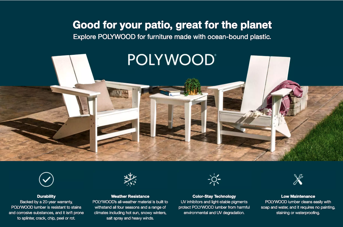
Image Source: POLYWOOD Target
Using video helps to amplify the consumer experience and keeps shoppers on the page longer on individual product pages. But make sure your brand uses this space and time wisely.
While having a video featuring the key points about the brand is excellent — but a video explaining and showing how to use, style, clean, assemble the product is even better.
Video Source: POLYWOOD YouTube
Consumers have adapted to scrolling. Give them the inspiration and aspiration they desire with in-depth details on where the product is made, materials, maintenance, and assembly. Align this information with product images. The result is informative, useful eye candy.
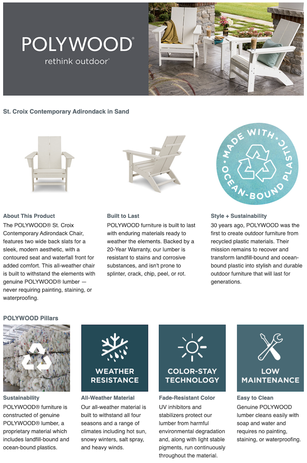
Image Source: POLYWOOD Target
Quite simply, easy-to-see and understand icons with attributes help consumers digest product information and features faster.
Think about all the product information that comes inside the box: Assembly instruction manual. Materials list. Warranty information. Maintenance tips. Your brand already has these product items in-house, so why not put them to further use on the product page?
The information on these downloads is helpful to consumers both as they are researching and with after-purchase satisfaction when instruction manuals often get tossed and users have further product questions.
Glassware brand Libbey uses its Amazon landing page to show its expansive product catalog. When researching, not all shoppers know precisely what they want to purchase and need guidance and brand expertise. This information is essential to expanding the consumer understanding of use.
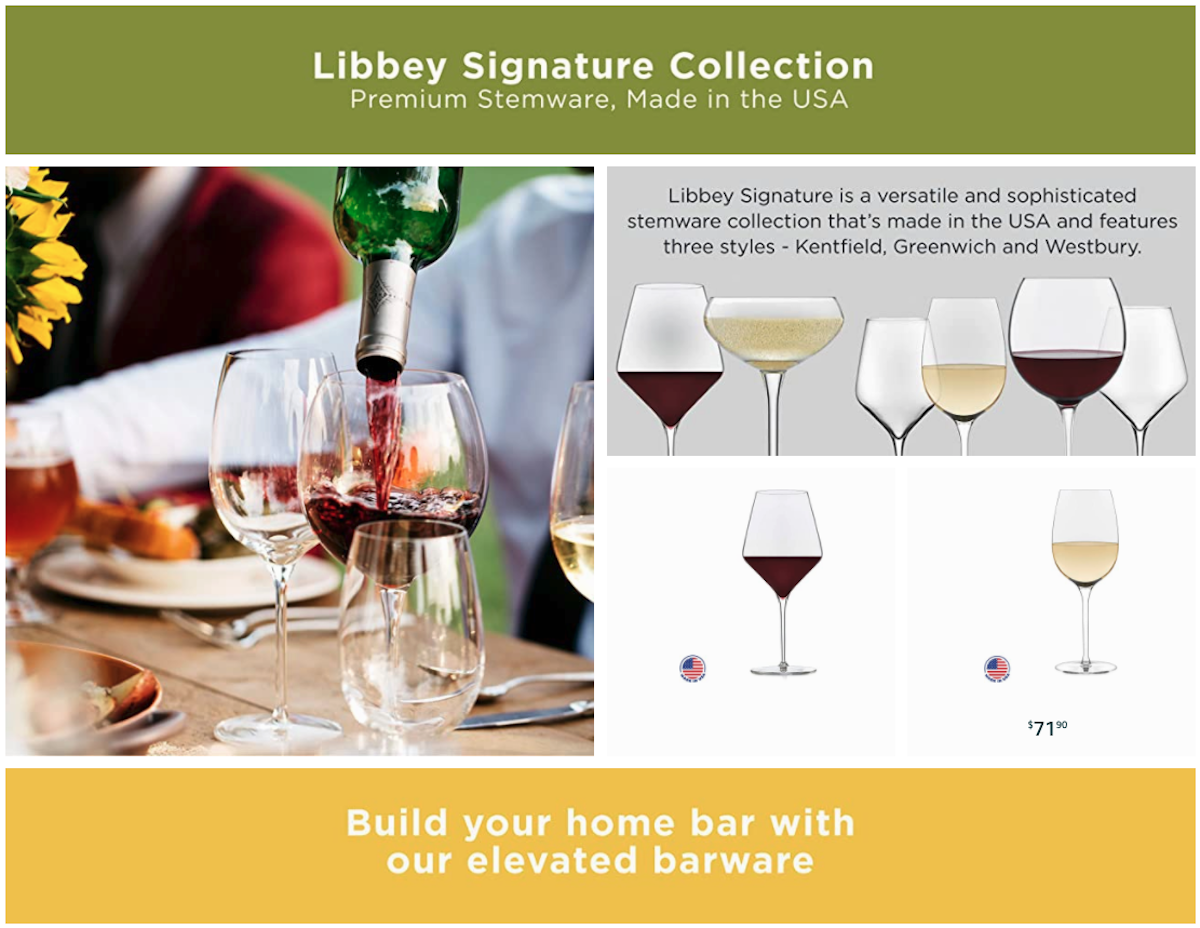
Image Source: Libbey Amazon
Inspire With Editorial Images and Captions
Stylized photos offer home display ideas and help consumers envision how they will use the products in their day-to-day lives and while hosting.
Highlight Products Origins
Telling the story of where products are made is an important detail to emphasize with enhanced content. Consumers love local vendors or handmade artistry. Where relevant, include these origination details that will elevate the specialness of the product.
Board game brand Goliath Games manufactures a wide range of products for families and children. Within this section of the home goods category, parents often seek more detailed information about the educational value
List and Show What Comes in the Box
Many adults have left the store with a toy gift only to realize the product does not come with batteries or another essential item. Enhanced content is an ideal place to show, outline, and explain exactly what can be expected when the packaging is open. It’s also a good place to ensure choking hazards are emphasized.
Video Source: Goliath Games
Include Comparison Charts
When researching, consumers are often flipping back and forth between multiple products. Make their shopping journey a bit easier by including a chart that compares products within your own catalog.
Tailor the chart features to your category. For some products, size specifications, end-use, included items, materials, and product weight are all important attributes. When it comes to games, the number of players, age ranges, game rules, and game-playing nuances are essential.
Highlight Educational Features and Age Groups
Shoppers want to know the benefits of having yet another toy in their homes. Use enhanced content to highlight the educational features and which age groups will benefit the most. Give as many reasons as possible for consumers to want to welcome the product home.
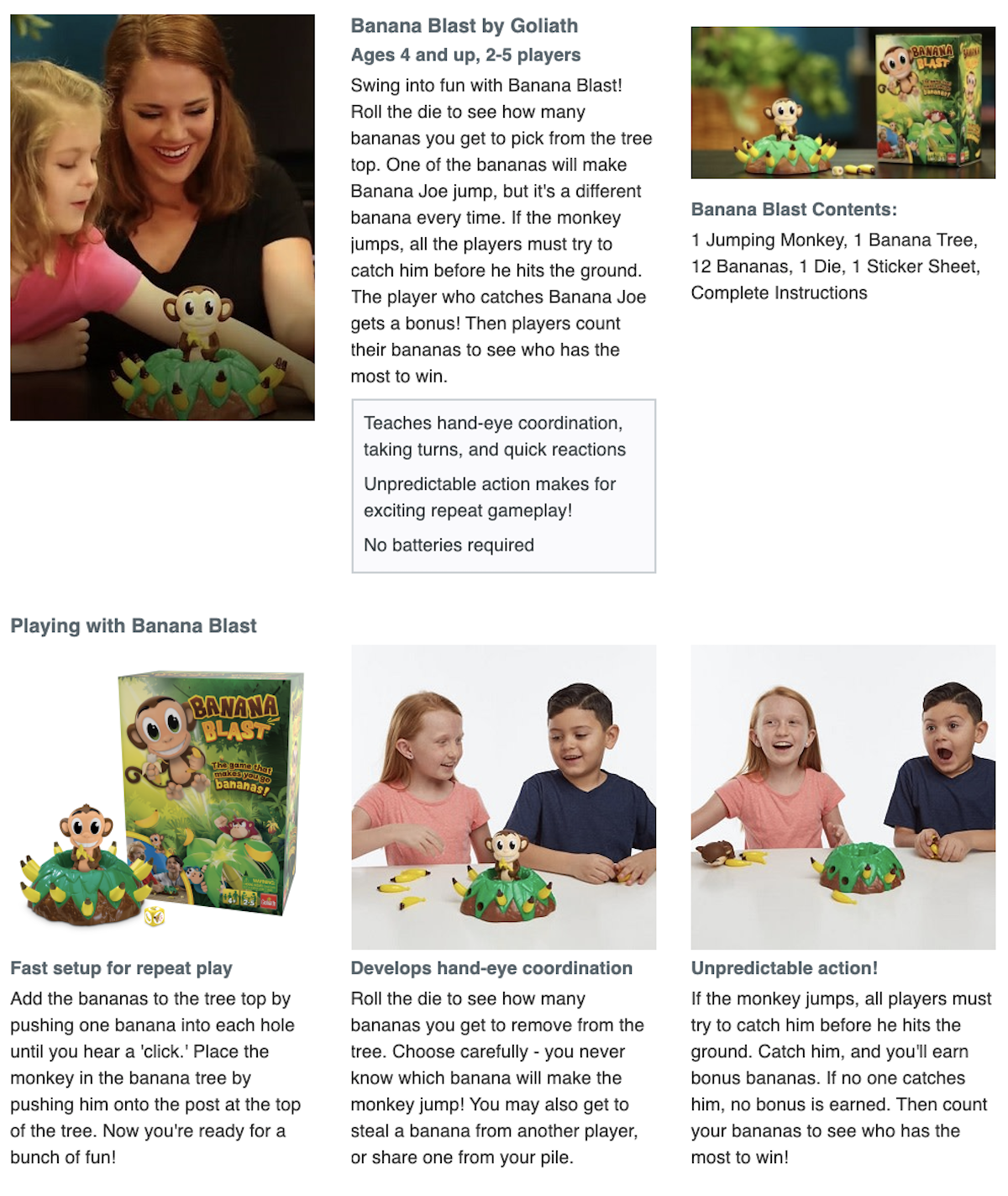
Image Source: Goliath Games Target
According to Salsify internal data, enhanced content can increase conversion by 15% across most categories. Consider your own online shopping experiences when thinking about why below-the-fold content can help drive conversion.
Images, videos, comparison charts, PDF downloads, and other enhanced content features help brands not only provide the information customers seek — but also help create an engaging product experience that informs and enriches the online shopping journey.

Download this product page toolkit to get everything you need to create engaging, high-performing product pages that drive sales and build trust with shoppers.
DOWNLOAD TOOLKITSalsify helps thousands of brand manufacturers, distributors, and retailers in over 140 countries collaborate to win on the digital shelf.
Standing out on the digital shelf starts with access to the latest industry content. Subscribe to Below the Fold, our monthly content newsletter, and join other commerce leaders.