Different retailers call enhanced content by different names: Amazon calls it A+ content, and Walmart calls it rich content.
While each retailer uses enhanced content in varied ways, research shows consumers are more likely to purchase when enhanced content is present on a product detail page (PDP).
Brands don’t need to go through added, taxing efforts to accommodate each retailer’s requirements. Using Salsify’s Enhanced Content capabilities, brands can formulate comparison charts, image galleries, videos, editorialized storytelling, and more for multiple products at scale.
Using easy-to-assemble, rule-based templates, they can then activate the content across top retailers from a single, integrated platform.
3 Brands' Winning Product Detail Pages
For household and cleaning essentials brands, where the product use and critical features likely won’t change drastically from one retailer shopping audience to another, winning PDPs use a range of image- and icon-heavy content to sell their products and tell their brand stories on the digital shelf.
Here are three examples of winning household brands.
1. Method
Born in 2001, the green, designed-focused home cleaners went from being in a single store in California to most major U.S. retailers and features more than 60 products.
The Method landing page features a colorful branded image and copy to let consumers know they’ve reached the right place on Walmart.
Load Image Galleries With Helpful Tips, Tricks, and Essential Features
Image galleries are a visual, consumer-engaging use of enhanced content space. Ensure each piece of content is maximized. Leave behind the quippy, short lines, and equip consumers with information-rich details.
- Better: Image galleries with single-copy lines
- Best: Image galleries filled with informative, helpful product details
Introduce or Reintroduce Consumers to Brand Values
Method dedicates a section of most of its enhanced content space to talk about its brand values and how the products are conjured, crafted, and designed to be green.
They also highlight their Platinum LEED and Platinum TRUE certified for zero waste soap factory in Chicago.
- Better: Reiterating the brand tagline
- Best: Diving deeper into the core values and community that consumers might be seeking
Showcase a Balanced Combination of Branded and Product-Specific Information
When talking about your products and brand, having too much information about the brand doesn’t give the consumers the in-depth product details they are expecting. Too much information about the product limits cross-selling and brand-building opportunities. Balanced, consistent product content is key.
- Better: Brand- or product-focused content
- Best: An even approach that states consumer needs for product information and brand allegiance
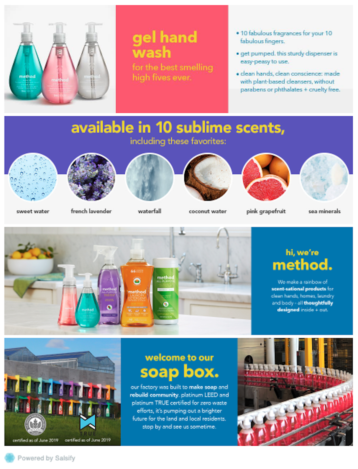
Image Source: Method Walmart
2. Clorox
Even the well-known, legacy cleaning and home essentials brand Clorox maximizes extra product storytelling exposure on its Target PDPs and uses the space to communicate and build confidence with consumers.
Double-Expose New Catalog Offerings While Highlighting Proprietary Features
When introducing a new product line to consumers, use PDPs to explain the patented or proprietary technology behind the products. Talk about the effectiveness and appealing scents like Clorox does: “Our powerful Clorox Scentiva toilet cleaners don’t just sanitize and remove tough stains like limescale, rust, calcium and hard water, they fill your bowls with captivating scents too.”
- Better: Use the space as a branded ad
- Best: Teaching consumers about the one-of-kind features or formulas in your products
Inspire Consumers Using a Visual Product Overview
Front-load shoppers with ideas on where and how they can use the item. A visual product overview (images and corresponding copy over top) explains the effectiveness, uses, properties, and benefits of a product, grabs the attention of consumers, and makes learning about the product quick and fun.
- Better: Plenty of bullets describing features
- Best: A product overview using aspirational images and clear, quick, helpful copy points
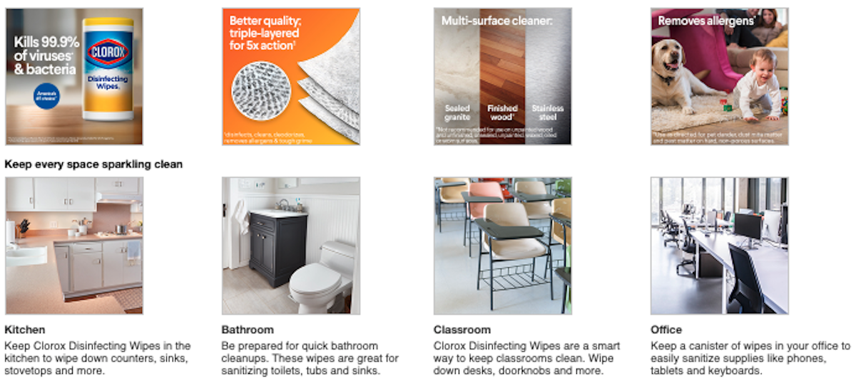
Image Source: Clorox Target
Visually Outline Step-By-Step Product Instructions
When talking about the Clorox ToiletWand, the brand makes a seemingly simple to understand product powerful and multi-faceted by outlining step-by-step uses and properties. They simultaneously highlight how the product is preloaded with the cleaner to make scrubbing under the toilet rim, clearing bowl stains, and deodorizing more interesting and can’t-live-without.
- Better: Listing product how-tos
- Best: How-to videos and image galleries
3. Rowenta
Rowenta’s landing page on Amazon is proof branding content can be simple yet impactful. With a clear, telling tagline and image, consumers shopping for high-quality garment steamers and irons are already enticed to want to know more.
Proactively Answer Consumer Questions
When reading through the bullets, consumers often have questions. Many then ask these questions in the Q&A section at the bottom of Amazon’s PDPs. Review these questions often, and include some of the most frequently asked in the enhanced content.
Rowenta does this well by highlighting a stand-out, but somewhat confusing feature and answering “What is a Steam Station?”
- Better: Thinking like a consumer and answering questions before they are asked
- Best: Referencing ‘Customer questions & answers’ section for often-asked questions and optimizing content with those answers
Help Consumers Decide With Comparison Charts
Products within your catalog can have the smallest of differences in details. Consumers may not understand why one product may be more expensive than another one. Do the cross-reference work for them and list out six or more features in comparison chart form.
- Better: Comparison charts created by retailers
- Best: Comparison charts consisting of your own brand products
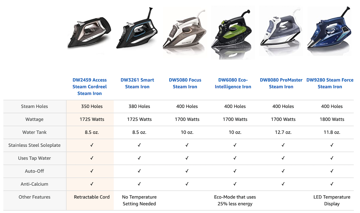
Image Source: Rowenta Amazon
Design Easy-to-Understand Icons for Faster Scanning of Product Information
Consumers are moving fast while they research. Make their journey speedier and easier by designing iconography to describe your product features and formulas. According to a Salsify 2020 consumer research report, if consumers need to dig for the information they’re seeking, 58% won’t click buy.
- Better: List features in bullet form
- Best: Reiterate those features using instantly-understandable icons



.svg)