PIM
Learn about Salsify’s enterprise PIM solution.
Syndication
Easily syndicate product content to every consumer touch point.
Enhanced Content
Easily enrich product pages with below-the-fold content and rich media.
Catalog Sites
Share secure, on-brand, and always up-to-date digital product catalogs.
Automation and AI
Automate business processes and enhance Salsify workflows with AI.
Digital Shelf Analytics
Continuously optimize your organization’s product content syndication.
GDSN Data Pool
Synchronize standard supply chain, marketing, and ecommerce attributes globally.
PXM Platform, Integrations, and APIs
Integrate the PXM platform with the rest of your enterprise systems architecture.
Grocery Accelerator
Leverage the first-ever category-wide PXM accelerator in the grocery industry.
PXM App Center
Gain extensions, integrations, and destinations with the PXM App Center.
Supplier Onboarding
Accelerate supplier onboarding while ensuring your schema requirements are met.
Product Listing
Sell products faster with Product Listing.
Content Enrichment
Increase online conversions with Content Enrichment.
Automation
Win on the digital shelf by automating manual tasks.
SXM Platform, Integrations, and APIs
Integrate the SXM platform with the rest of your enterprise systems architecture.
Syndication Network
Automate how you exchange product content data to the digital shelf.
Enhanced Content Network
Use Enhanced Content to turn product pages into product experiences.
Commerce Platform Integrations
Create winning product experiences everywhere shoppers are, including on owned sites.
GDSN Data Pool
Synchronize standard supply chain, marketing, and ecommerce attributes globally.
Open Catalog
Connect to the digital shelf faster with an open, standardized, and free product catalog.
Resources
Resource Library
Explore our ecommerce resources to get everything you need to win on the digital shelf.
Blog
Read our blog to get actionable insights for navigating changing markets and industry demands.
Webinars
Watch our on-demand ecommerce webinars to gain expert advice and tips from our community of industry leaders.
Engineering Blog
Explore our engineering blog to get developer resources, insights, and tips.
Events
Register for our upcoming in-person and virtual events to connect with other industry insiders.
Knowledge Base
Investigate our knowledge base to build your Salsify skills and understanding.
Product Updates
Explore the latest news and updates for Salsify products.
API
Examine our comprehensive API and webhook guides to start working with Salsify quickly.
Download Salsify's report to get insights into the latest trends and consumer behaviors.
A Digital Shelf Guide
Ecommerce can’t function without product pages, also called product detail pages (PDPs). They’re so inescapable that brands may not spend much time thinking about them — but that would be a mistake.
How a product page is structured and designed can determine whether or not a consumer decides to buy your product because it impacts their confidence in their purchase, their impression of your brand, and whether they’ll buy from you again.
Learn how to build and optimize your product pages, explore the different parts of a PDP, get tips for building the best shopping experiences, and explore top product detail page examples to inspire you. Use it to boost sales by creating, refining, or perfecting your brand’s PDPs.
Product pages that lack good product content can cause consumers to look elsewhere if they’re not completely certain about what they’re buying, and a dull or boring product page design can also cause shoppers to bounce.
Here’s everything that you could include on a product page: the necessities and the elements you’ll want to add if you really want to stand out against the competition.
Every product page needs to have the following basic elements.
Product Title
The product page title should be a clear and specific description of your product that’s optimized for keyword search.
Product Description
A good product description includes both a brief paragraph describing the product and bullet points highlighting the product’s main features. Both should be clear, concise, engaging, and optimized with relevant keywords.
Write Great — Not Just ‘OK’ — Product Descriptions |
Images
Shoppers need to know what your products look like. Be sure to include multiple images taken from different angles so they can see exactly what they’re getting. Images should be high quality and include alt text optimized for search engine optimization (SEO).
Pricing and Shipping Information
Consumers need to know the price of what they’re buying. Knowing shipping options will also help them determine if they can afford the product.
Product Availability
Consumers need to know if a product is in stock before purchasing.
Product Options (If Applicable)
For products that come in different colors, sizes, etc., consumers need easy ways to select their preferred option.
The above are all important elements of a helpful and effective product page — but they’re also elements that nearly every product page on the internet contains. How can you truly make your product content stand out?
The exact answer will depend on your approach to branding and what your consumers value most. But these ideas can get you started.
Customer Reviews
The majority of online shoppers rely on reviews when making purchasing decisions. Review platform Trustpilot found that 89% of global consumers read online reviews, and 49% consider them to be a top influence on whether they buy. The social proof of reviews makes your brand appear more trustworthy while also helping your shoppers learn more about your products.
Videos
Show your product in action. A video provides more information than a static photograph and is more engaging.
Recommended Products
Consumers now expect that product pages will recommend similar products or products that are often sold together. This makes it easier for them to find exactly what they want, and it also gives you opportunities to upsell. A best practice is to personalize the recommended products section based on past user activity.
FAQs
Addressing common consumer questions helps shoppers learn more useful information about your product while also boosting your brand’s trustworthiness.
Customer Questions
This is similar to FAQs, except shoppers can submit questions and publicly receive answers from brand representatives. Your brand establishes trust by demonstrating its responsive customer service while future shoppers gain more helpful information about the product.
Product Comparison Charts
Showing how a product compares to similar products you offer can help shoppers select the item that best meets their needs.
Customer Support
A study from customer relationship management (CRM) company Salesforce found 92% of global consumers return to a brand after a positive customer service experience, so it’s important to ensure customer support is easily available to all shoppers. The same study found that 83% of people want to solve issues immediately, so make sure you’re enabling this kind of frictionless support through accessible channels like live chat.
Return and Other Policies
Make it easy for consumers to find information about returns, warranties, and similar policies by putting them right on your product page. This helps shoppers buy with more confidence.
User-Generated Content (UGC)
Social proof will always be more effective than product copy in convincing someone to buy. A recent study from social content platform Tint found that 72% of shoppers trust the testimonials of fellow consumers more than they trust the brands themselves.
That’s why user reviews are important, but many successful brands go beyond reviews. To leverage even more user-generated content (UGC) on your product page, consider letting satisfied shoppers share pictures or videos of the product in action, either as part of their reviews or in the form of influencer social posts.
Beautiful Design
The color scheme, layout, and other design elements you choose when designing your product page all send a message about your brand identity.
Many product pages are simple and streamlined, and that may be the right choice for your brand. Other brands find success with colorful, eye-catching product pages.
Enhanced Content
Enhanced content, also called rich media, below-the-fold content, or A+ content, goes beyond the bare minimum product content to deliver additional product content with a wide range of engaging assets like image galleries, feature tours, comparison charts, PDFs, and more.
Enhanced content solutions can help brands create engaging product experiences at scale, helping them optimize their content strategy to boost conversion rates. Salsify internal data found that brands with enhanced content had 15% higher conversion on average compared to brands without enhanced content.
Why? Enhanced content helps to engage shoppers and answers any remaining queries to help them make a more informed purchase. Creative or interactive approaches to product content keep shoppers engaged and encourage them to linger on the page.
See how three leading brands, Chicco, Cliff, and Libbey, leverage Salsify's Enhanced Content to enable product discovery, increase engagement and boost conversion.
There’s room for optimization on even the best ecommerce product pages. To win more sales and avoid abandoned shopping carts, take some time to evaluate what your product pages currently do well and how they can improve.
Do You Have ‘Bad’ Product Content? |
Ask yourself the following questions to find opportunities for optimization.
Is Your Product Page Copy Clear, Direct, and Easy To Understand?
Make sure your copy is easy for anyone to understand, even if they know nothing about your industry. Your product description should be specific and thorough — without being overly wordy. While creative language can enhance engagement, it should never come at the expense of clarity and conciseness.
Does Your Product Copy Include All Essential Product Details?
It can be surprisingly easy to forget to mention small details about your product that your consumers would need to know. Audit your copy to make sure it really is as comprehensive as it needs to be.
Does Your Product Copy Adhere to a Distinct Brand Voice?
Your marketing team has likely developed comprehensive guidelines on what kind of tone and voice to use when creating branded copy. Make sure all product copy aligns with it.
Have You Considered Approaches to Copy That Expand Beyond the Traditional?
You likely already have a brief overview and some bullet points written, but there’s so much more you can do with product copy. Consider whether your brand could benefit from additional blurbs farther down the page, diagrams that explore the materials used, and other forms of copy.
Do You Have Attractive Images That Clearly Depict What Your Product Is and What It Does?
Audit your images to make sure they all have good lighting, good composition, and good shots of your product. You should have several images showing the product from multiple angles, as well as images and videos that show the product in use.
Does Your Product Page Follow Principles of Good User Experience (UX) and User Interface (UI)?
All product pages should be both attractive and intuitive. Have UX and UI experts in your organization look over your ecommerce product page design and make sure it’s both pleasing to the eye and easy to interact with.
Does Your Product Page Have Attractive, Eye-Catching Enhanced Content?
Enhanced content means elements like videos, hover-over hotspots, comparison charts, and more. Including these elements makes the page more engaging, informative, and visually appealing — just make sure you get UI input to keep it from looking cluttered.
Does Your Product Page Adhere to Your Brand Design Guidelines?
Your branding team has likely chosen specific colors and other design elements to make up your brand’s visual identity. For a cohesive look across the site, make sure those elements are incorporated in your product detail page design.
Does Your Product Copy Contain Relevant Keywords?
Strategic keyword use is essential if you want consumers to find your brand when searching for products online. Use well-researched, long-tail keywords multiple times in your copy. However, make sure your keyword usage sounds natural and that you avoid stuffing your copy with keywords that don’t make sense in context.
Are Relevant Keywords Included in HTML Elements, Such as Metadata and Image Alt Text?
Just as important as keyword usage in copy is keyword usage in your HTML. Search engines crawl page titles, meta descriptions, and alt text for images, so be sure to include keywords in those elements.
Does Your Page Load Quickly?
The quality of a user’s experience on a webpage impacts how high Google will rank it. Not only that, but a slow-loading page is sure to lead to a higher bounce rate. Make sure your product pages load quickly and follow other web design best practices.
Is Your Page Responsive?
Responsive design, or web design that guarantees a page looks good on any type of screen, is essential. Mobile web traffic accounts for 58% of all internet usage worldwide, according to Statista, so designing primarily for desktop is sure to alienate some visitors. It’s also important to remember that Google will rank sites with good mobile design higher in mobile searches, according to SEO software company Moz.
Boost SEO Rankings |
Do You Have Customer Reviews, Answered Questions, Interactive Enhanced Content, and Other Features That Invite Shoppers To Stay on the Page?
Enhanced content gives shoppers more to explore, which in turn keeps them on the page. Reviews and answered questions promise more information relevant to their experiences, while videos and interactive content make your page more interesting.
Do You Display Related Products To Encourage Visitors To Keep Shopping?
Consumers expect product pages to include links to related products for them to investigate. Displaying these products can help them find the exact item they want — or encourage them to buy additional items from you.
Does Your Product Page Include Personalized Recommendations?
Even better than generic recommendations are personalized recommendations. Shoppers expect to see this level of personalization on a product page, and a personalized recommendation that accurately guesses what a shopper wants is an excellent way to keep them on your site. It can make visitors more interested in and engaged with your brand, on top of being more likely to buy.
Does Your UX Encourage Users To Continue Scrolling Down Your Page?
An attractive design can draw visitors in and even encourage them to scroll further down the page than they otherwise would have. In addition, you can make new images, animations, or other features appear as the visitor scrolls, turning the act of scrolling itself into a source of entertainment.
All of the above increase conversions, but there are steps you can take to grow your conversion rate even more by removing friction from the act of purchasing.
Is Your Call-to-Action (CTA) Obviously Visible?
Even the smallest amount of extra effort can cause a shopper to leave your page, so make the “Add to Cart” button extremely easy to find. Making it sticky at the top of the page is even better.
Is Information About Shipping, Returns, and Stock Availability Easy To Find?
Consumers need to know this information to make an informed choice about their purchase, so ensure that it’s easy for the shopper to find.
Can Consumers Find Information About Sales, Discounts, or Loyalty Programs?
Special perks like these can help increase conversions — and raise the likelihood that consumers will come back for more.
Are There Avenues for Shoppers To Ask Questions?
If a shopper has a question about a product that they can’t find the answer to, they may not feel comfortable buying it. However, if there’s an easy way to ask their question, doing so can put their mind at ease. Live chat support can be a great option for consumers who want an immediate answer, but any form of support is better than no support.
Ecommerce trends change constantly. What works today won’t necessarily work tomorrow.
That means it’s essential to constantly test and re-optimize your product pages to make sure you always have the best ecommerce product pages possible. Don’t wait until you start seeing sales dip. Instead, schedule the product page refreshes one or two times a year. And be sure to always read up on ecommerce product page design trends and best practices, so you know what this year’s customers expect to see.
Download our guide to get insights into the most essential product page best practices — with examples from top brands.
DOWNLOAD GUIDEThe following product detail page examples are beautifully designed and contain everything consumers need to make informed purchasing choices. From basic Amazon pages to creative direct-to-consumer (DTC) sites, these product page examples can spark inspiration for any brand looking to bring new life to their product pages.
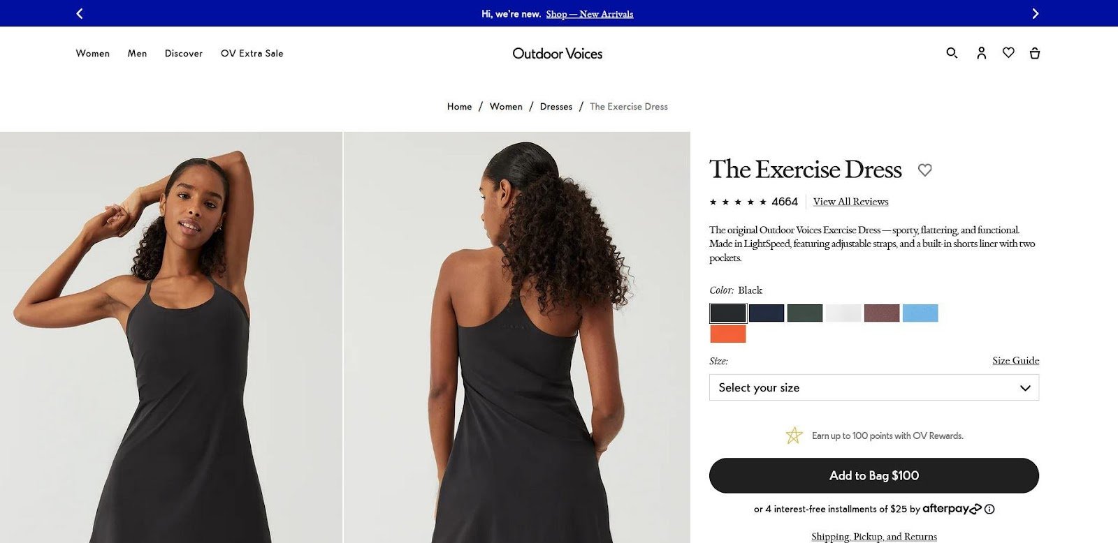
Image Source: Outdoor Voices
Athleticwear company Outdoor Voices proves that you don’t need to do anything too complicated to make a stand-out product page. Their sleek, black-and-white design is easy to navigate, with concise copy and easy-to-find product details that entice the visitor to buy.
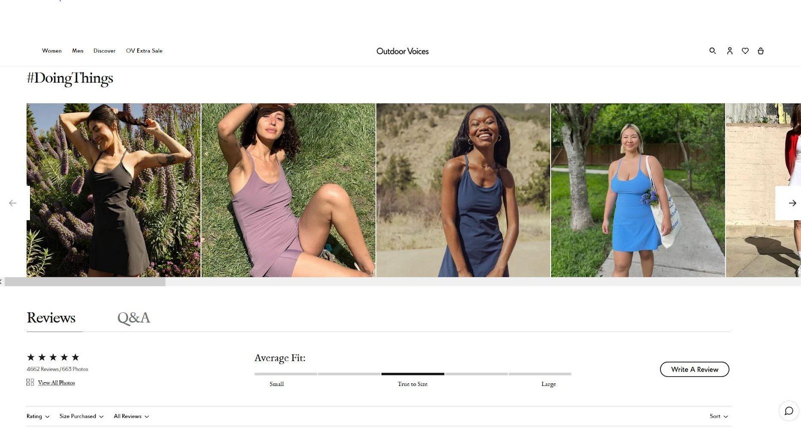
Image Source: Outdoor Voices
Especially clever is the inclusion of images featuring models with different body shapes, so shoppers can understand what the clothing might look like on them. If they scroll down, they can see the product on even more types of people thanks to a collection of social posts from satisfied shoppers — an excellent use of social proof.
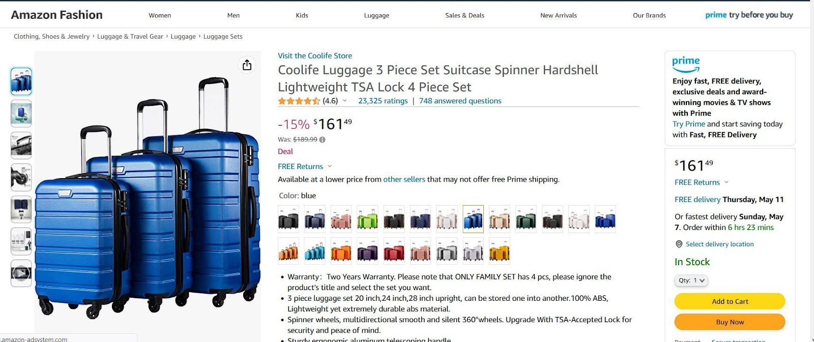
Image Source: Coolife
Most product pages are built on third-party retailers like Amazon, but that doesn’t mean they can’t be stunning. Luggage brand Coolife demonstrates this with an Amazon page full of enhanced content. By using several detailed product images, eye-catching graphics, helpful comparison charts, and more, Coolife turns an Amazon page into a unique shopping experience.
Image Source: Coolife
Taking advantage of the power of social proof, Coolife leverages UGC by hosting consumer-produced videos on its Amazon page, giving shoppers a chance to see the product used in the real world.
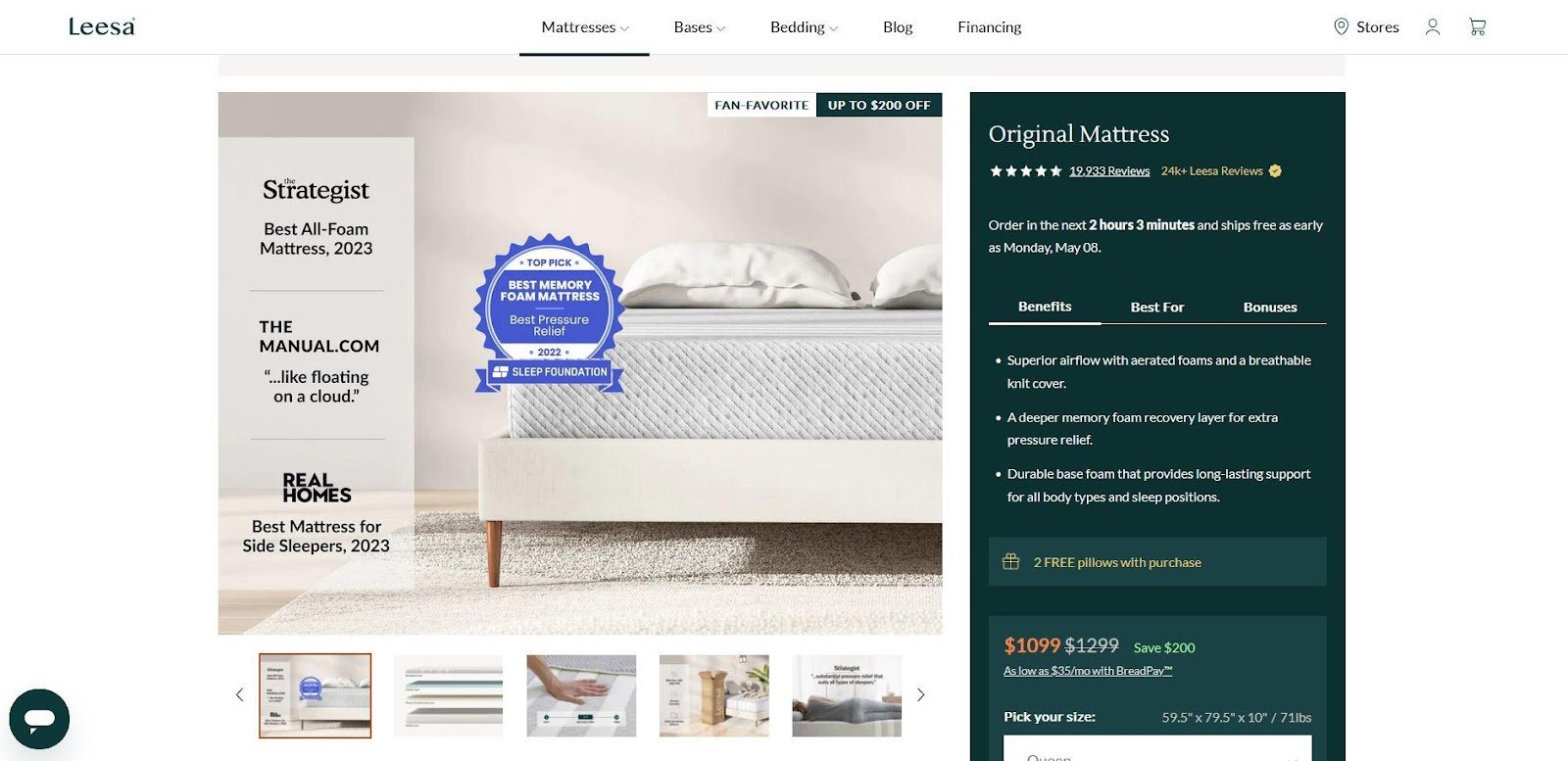
Image Source: Leesa
The mattress brand Leesa has a clear, compelling product page design that balances sleekness with a soothing color palette. The copy sorted into three alliterative tabs (“Benefits,” “Best For,” “Bonuses”) gives shoppers all the basics in a quick, digestible way, and scrolling down reveals more digestible information.
Image Source: Leesa
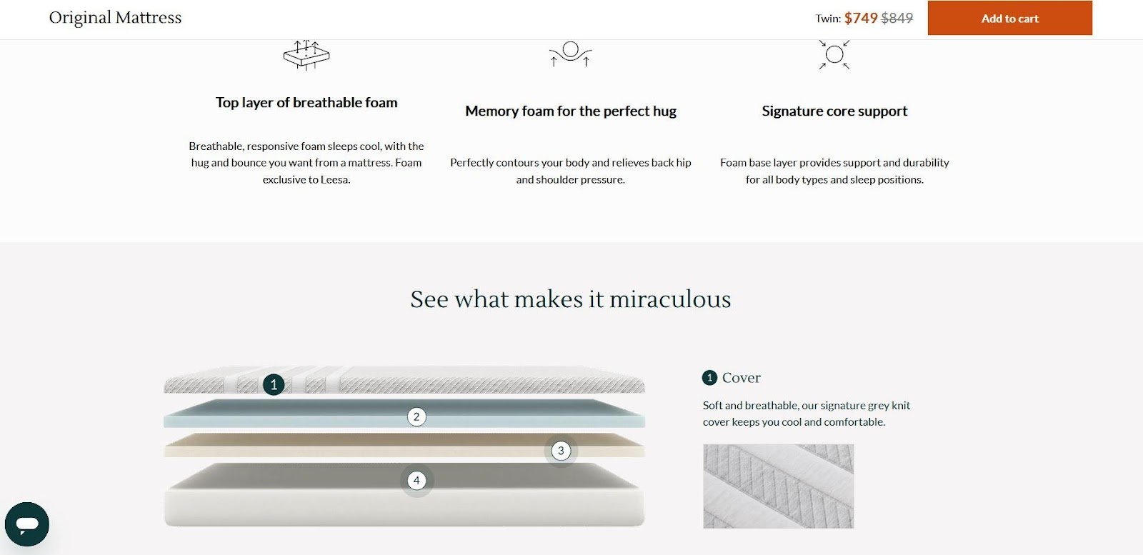
One of the best features of this product page is the interactive content that lets shoppers click on a diagram of the mattress to discover more about it. Also, note how the “Add to Cart” CTA is sticky, following the visitor all the way down the page.
Image Source: Keurig
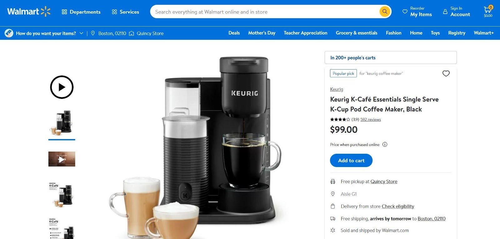
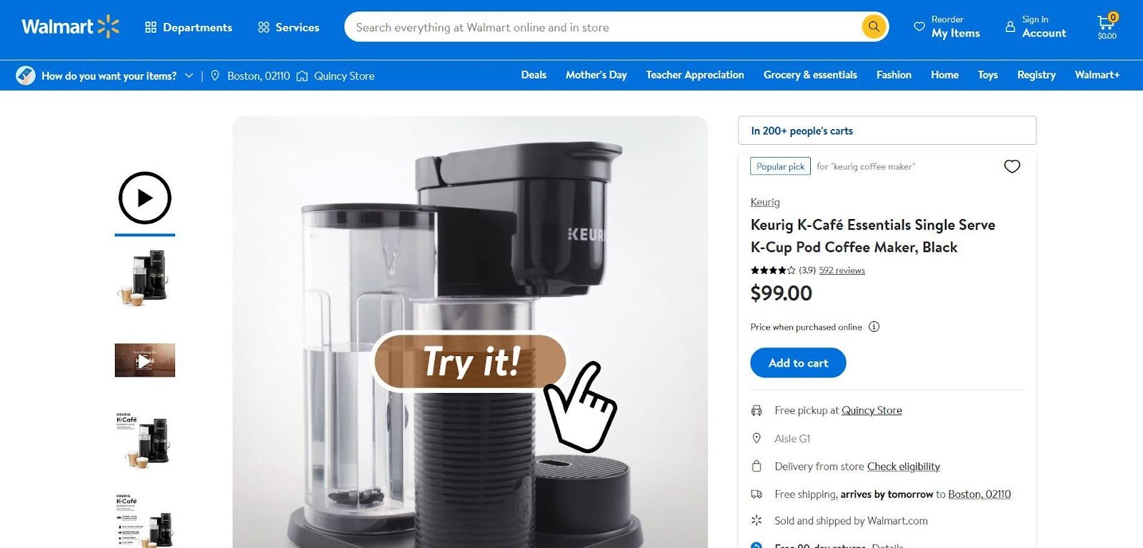
One of the biggest challenges of ecommerce is the fact that shoppers can’t try out a product before buying it. Keurig compensates for this on the product page of its Pod Coffee Maker. The visitor is greeted with a large animated image inviting them to “Try It.” When they click the image, they can participate in an interactive walkthrough of how they would use the product in real life.
Image Source: Keurig
This memorable product page is an excellent example of how content can be used to engage shoppers. Not only that, but it takes a basic product page on a third-party retailer and turns it into something special.
Image Source: Our Place
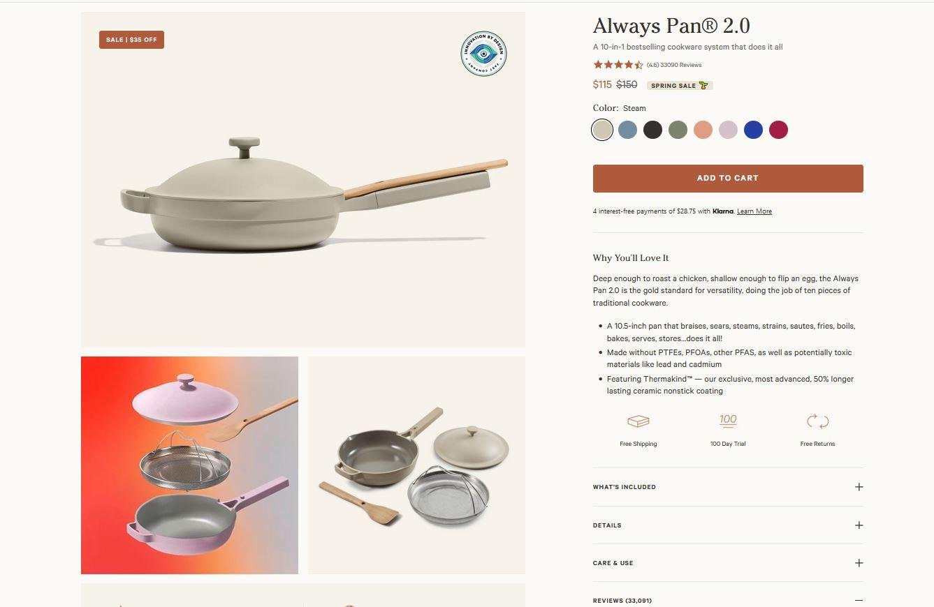
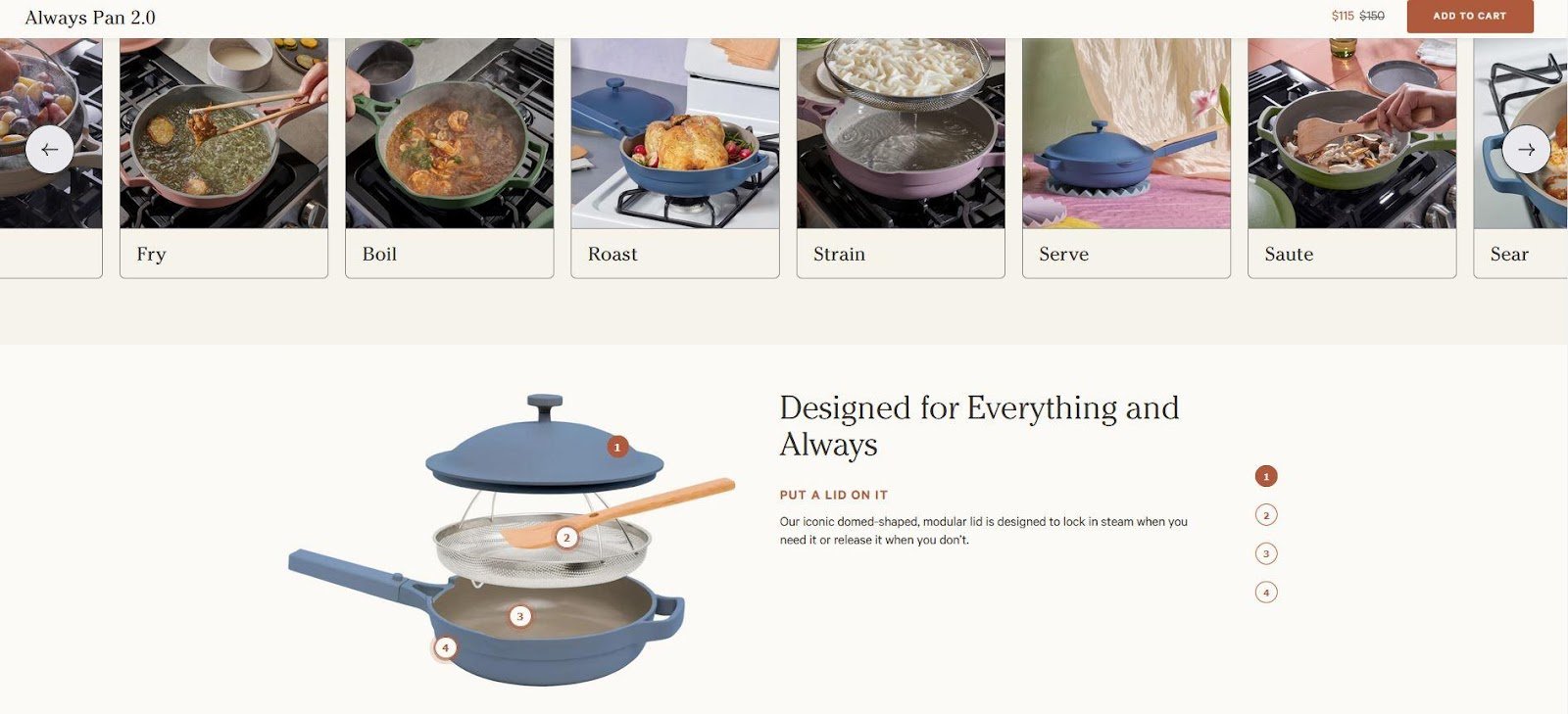
Home goods brand Our Place has a product page design that balances a sharp layout with a homey color scheme, and it greets the shopper with images and copy as compelling as they are helpful. A few select reviews are featured high up on the page, so shoppers can see why people love it without having to scroll all the way to the bottom.
Image Source: Our Place
Our Place highlights the product’s functionality more than anything else, but it manages to do so in an interesting way by inviting the visitor to explore interactive content. There’s a carousel that highlights all the possible uses of the product, an interactive diagram that breaks down what’s included, and more.
Image Source: The Ordinary
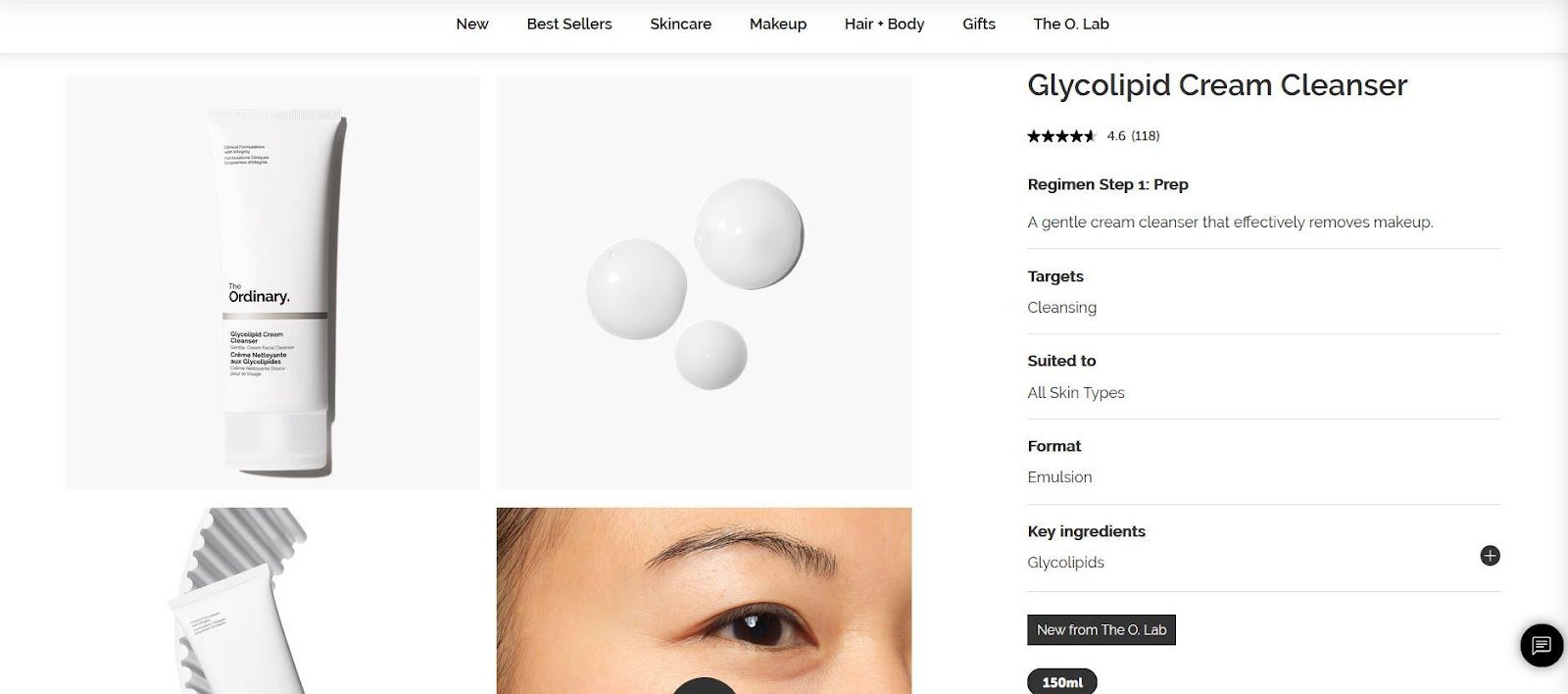
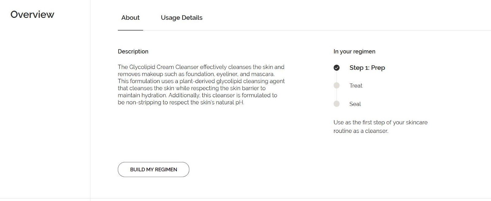
The Ordinary’s product pages are also lessons in skincare. They tell shoppers how the product they’re viewing would be used in a skincare regimen, give them suggestions for what else to include in their regimen, and even link to a page where they can create a customized skincare plan.
Image Source: The Ordinary
This content-heavy approach keeps shoppers on the page with information that, presumably, is interesting to anyone considering the product. It’s also a creative way to upsell shoppers. The Ordinary supports its educational approach with a minimalist, greyscale design that suggests scientific expertise.
Image Source: Papier
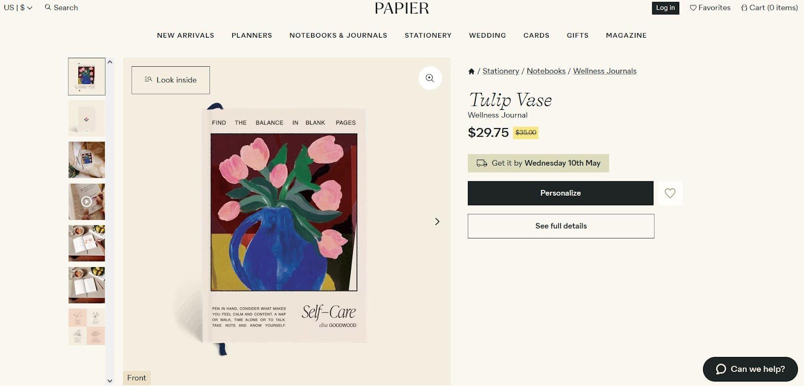
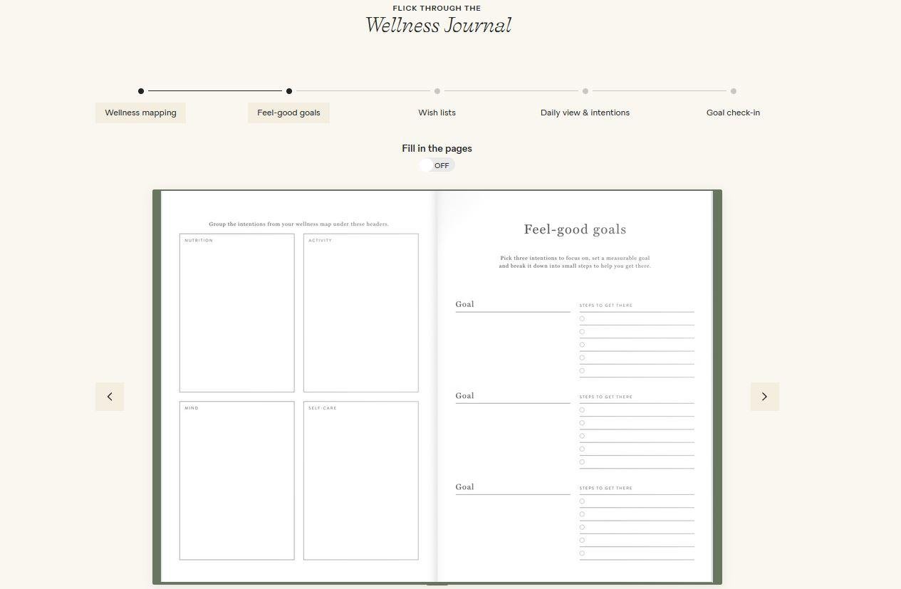
Papier’s beautiful product pages are characterized by an off-white color reminiscent of notebook paper. Shoppers who are browsing for the perfect notebook design see a display of similar products high up on the product page; those who are closer to purchasing can click “See full details” to reveal the product copy and enhanced content.
Image Source: Papier
Among the most compelling parts of this product page is the virtual journal, which allows shoppers to flip through every page of the journal they’re considering. Or, they can jump to specific sections to see what’s included. As a final clever touch, the product copy has links to content containing inspiration for ways to use the journals.
Image Source: Allbirds
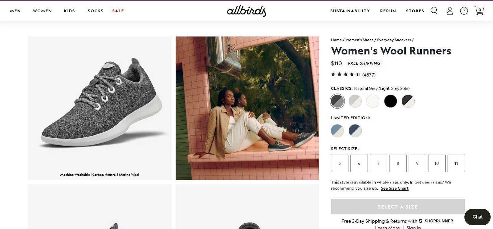
While reviews are definitely important to many shoppers, not every review is helpful to every person. Often, shoppers want to know what someone just like them thought of a product. But it can be hard to dig through all the existing reviews to find one that speaks to their needs.
Image Source: Allbirds
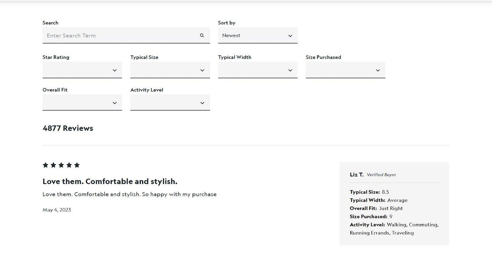
Shoe brand Allbirds solves this problem by making their customer reviews searchable. Shoppers can filter by a range of different attributes or do a keyword search to find the reviews most applicable to them. Reviews are also labeled with a list of attributes so visitors can immediately know how relevant they are.
Image Source: Drunk Elephant
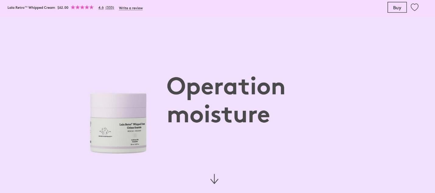
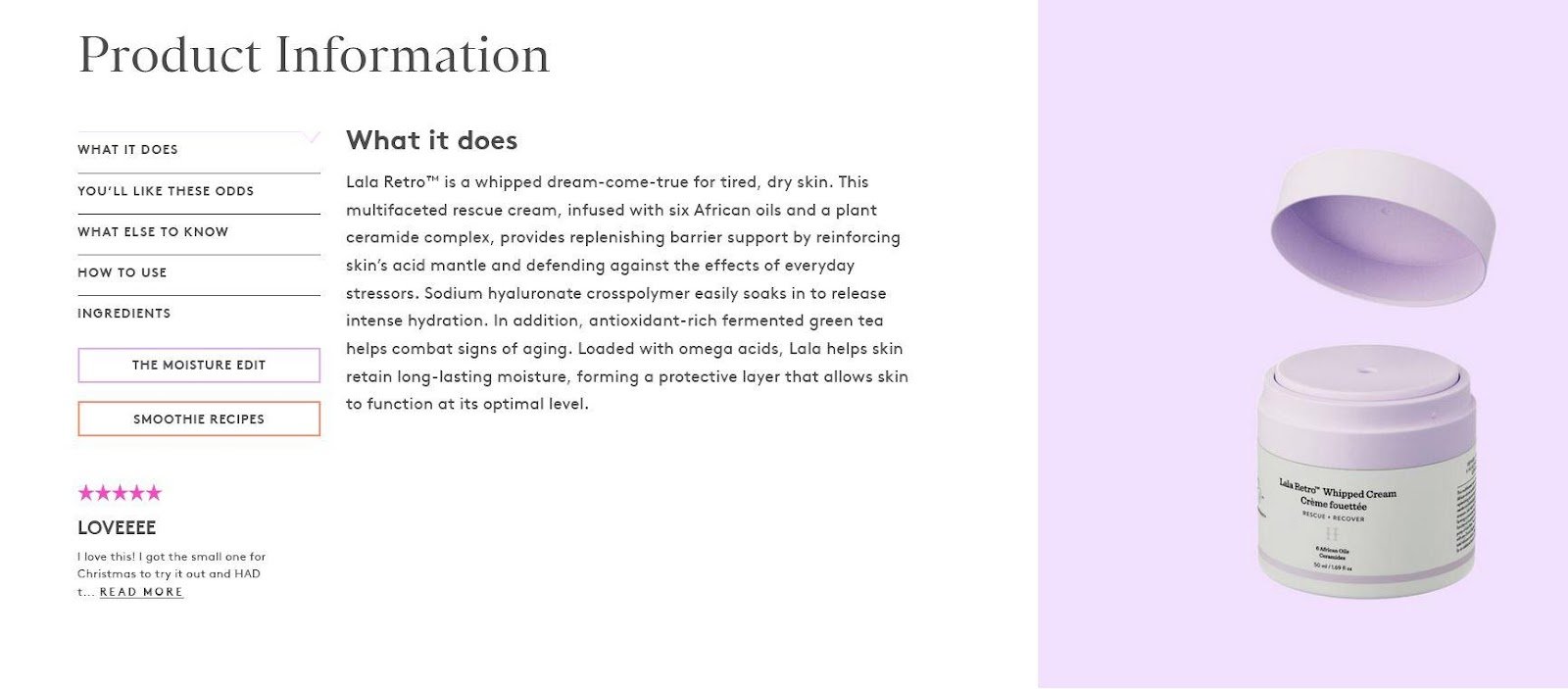
If you have a brand name as quirky as “Drunk Elephant,” it makes sense to build product pages fun enough to match. The beauty brand invites visitors to explore product pages that gradually reveal new information as they scroll. The visuals don’t always take the visitor down the page — sometimes, information unfurls horizontally across the screen, or graphics grow from the screen’s center.
Image Source: Drunk Elephant
It’s a fun, engaging approach that keeps visitors wanting to see more. The pages also include an interactive opportunity to explore a product’s ingredients and a note from the company’s founder toward the bottom. Every inch of the product page design is created to make the visitor feel that this brand is special.
Here are three key takeaways about the impact of high-quality product pages on omnichannel customer experiences.
READ BLOG POSTRead on for an overview of the benefits of A+ content, Amazon best practices, and PDP best practices to bring your pages to the next level.
READ BLOG POSTYour product page is your storefront in the digital world. A poorly organized, unattractive, or confusing storefront deters shoppers, but a beautiful one that’s easy to navigate invites them to linger and browse.
Crafting the best ecommerce product pages possible requires careful consideration, but it’s within reach for any brand. All that’s needed is a thorough understanding of product page best practices and how they apply to your brand.
Ready to begin your journey toward stand-out product pages? Download the “Complete Product Page Toolkit” to start building winning pages across the digital shelf.
DOWNLOAD TOOLKIT