How To Boost Your Product Page Conversion Rate
Written By: Lizzie Davey
The higher your conversion rate is, the more revenue you get. Easy, right? Regardless, your conversion rate might seem like an elusive ecommerce metric — but there are a number of strategies and tactics you can implement to boost rates across the digital shelf.
What’s a ‘Good’ Conversion Rate for a Product Page?
The average conversion rate for ecommerce sites sits somewhere between 1% and 4%, according to Adobe. These numbers are a little lower than the overall average website conversion rate of 3.65% because performance varies greatly depending on shoppers, pricing, marketing, products, and industry.
So, what’s a good conversion rate? The simple, but not satisfying answer: It depends. Ultimately, the industry you’re serving, the products you sell, and your audience all impact conversion rates.
To give you an idea, IRP Commerce found that fashion websites have an average conversion rate of 1.57%, while arts and crafts have a higher average conversion rate of 4.60%.
Why Your Product Page Isn’t Converting
If you’re looking at the numbers above and feeling disheartened because your site is falling below the average conversion rate, don’t panic. There could be any number of reasons your product page isn’t converting, but in industries with high competition, there’s a good chance your product page content is letting you down.
If shoppers can’t get the information they need immediately, there are plenty of other options for them to turn to. Tweaking the main elements on your product page and adding rich media is a great way to stand out and boost conversions.
Here’s where you might be going wrong.
Your Product Messaging Is Incomplete
Delivering the right message at the right time is crucial to driving sales. If your messaging is convoluted or simply doesn’t hit the mark, you risk confusing shoppers. It’s the same if you’re sending a generic message to all shoppers regardless of how they found you and where they sit in the sales funnel.
If you can deliver tailored messaging that considers what platforms a shopper came to your site from, the products they’re interested in, and any other useful information that’s based on their individual experience, you’ll dramatically increase conversions.
Your Product Copy Is Dull
Boring copy doesn’t sell. If your copy doesn’t speak directly to your target shoppers, accounting for their pain points, interests, and lifestyles, you’re likely to lose a lot of buyers. It’s the same if your copy is dull. If your words don’t match your brand’s personality and the products you sell, there’s an instant disconnect that can deter shoppers from buying.
Your Product Photos Are Low-Quality
In Salsify’s “2022 Consumer Research” report, half of the respondents said the quality of images is one of the top three factors that determine where they shop online. Remember, online shoppers don’t have the luxury of seeing a product in-person before they buy, so you need to lean on high-quality photography and other visuals to bring your products to life.
You’re Providing the Bare Minimum
The product page is the new packaging. Creating a tailored, rich experience for shoppers that includes multimedia elements to accompany the information they need to know can make a huge difference. If you’re not making the most of your product page with videos, comparison charts, product guides, and social proof, you could be missing out on a chunk of sales.
How To Create a Product Page That Converts
Now you know why your conversion rates might be sub-par, let’s take a look at how you can get those numbers up and create high-converting product pages.
Highlight Product Features and Benefits
Shoppers want to know what makes your product a better option than other, similar products on the market.
Don’t just list out the features, go one step further and highlight the benefits customers will get if they buy your product. This will help them visualize how your product will change or enhance their lives or, at the very least, how it will soothe a pressing pain point.
Consider including the proven results other shoppers have benefitted from. You can also add a comparison chart to help shoppers compare the different options on the same page.
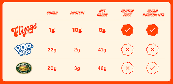
Image Source: Flings
Flings includes a comparison chart comparing the nutritional information of its products to other big names in the industry.
Write Detailed Product Descriptions
Product descriptions are a substitute for a shopper holding a physical product in their hands. Salsify’s “2023 Consumer Research” report found that consumers in the U.S., the U.K., France, Germany, and Australia all ranked product descriptions as the most important factor in determining where they shop online.
Go beyond a simple paragraph description and dive into as much detail as possible. Fill out bullet points with features and benefits, describe the product as accurately as possible, and include all relevant information, such as ingredients, materials, history, and manufacturing.
This is particularly important for high-ticket items where customers take more time deciding whether to part with their money.
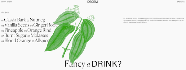
Image Source: DECEM Gin
DECEM Gin includes a breakdown of each ingredient and its accompanying flavors in the product description.
Add More Visuals
Visuals are crucial in helping shoppers determine if a product is the right fit for them. Being able to see a product from all angles and in action can help customers visualize what it’ll be like in person and reduces the chances of post-purchase returns.
As well as high-quality product photos, incorporate 360-degree views, interactive graphics, and videos to show your product in its best light. Research by HubSpot revealed that adding a product demonstration video to product pages can get 73% more people to buy.
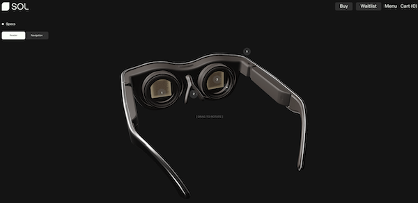
Image Source: SOL Glasses
SOL Glasses has an interactive product diagram on each product page that shoppers can drag and click on to find out more.
Include Customer Reviews and Ratings
According to a report by PowerReviews, 99% of customers read reviews when they shop online. Seeing what previous customers thought about your products provides reassurance and peace of mind, but it also helps shoppers uncover things that might not be included in the product description.
Add customer reviews to your product pages — both good and bad to provide a neutral (and honest) perspective. You can also incorporate other social proof in the form of user-generated content, customer videos, and case studies if they fit well with your product.
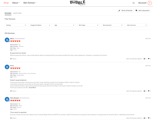
Image Source: Hello Bubble
Hello Bubble includes searchable customer reviews on each product page. Even better, shoppers can filter the reviews based on the rating, media, and relevant attributes.
Make the Most of Enhanced Content
Enhanced content is information that goes beyond the product title, description, and hero image. It’s usually found “below the fold” and includes rich media elements like customized product descriptions, videos, galleries, feature tours, comparison charts, and downloadable materials.
Research by Salsify revealed that enhanced content can increase product page conversion rates by 15%.
Answer Common Questions
When a shopper is actively in buy mode, even the tiniest bit of friction can have them running to the nearest competitor. This is where FAQ sections come in handy. They provide answers to common questions so that shoppers can make quick decisions while they have their wallets out ready to buy.

Image Source: Experiment Beauty
Experiment Beauty includes an FAQ tab on all its product pages that answers common questions shoppers might have.
Maximize Your Call-To-Action
Your call-to-action (CTA) tells customers what you want them to do next, whether that’s adding a product to their cart, finding out more information, or buying in one click. The more your CTA stands out, the easier it is for shoppers to move through the sales funnel to checkout.
Make sure your CTA is eye-catching, includes action-based copy, and is visible at various points throughout the product page.
As noted by HubSpot, CTAs with plenty of white space around them increase conversions by 232%.
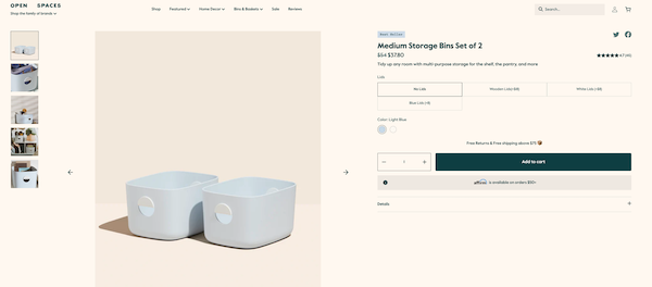
Image Source: Open Spaces
Storage brand Open Spaces incorporates a high-contrast CTA that stands out against the neutral background.
Add a Live Chat Element
If an FAQ section doesn’t quite answer a shopper’s questions, having a live chat option can help remove potential friction from the buying process. It allows them to get their questions answered quickly, either by trained artificial intelligence (AI) or a live agent. Even better, this creates an instant connection and helps you gather data to personalize the experience moving forward.
As noted by business solutions platform SuperOffice, customers prefer to use live chat to contact a brand, with most shoppers expecting ecommerce websites to have a live chat option.
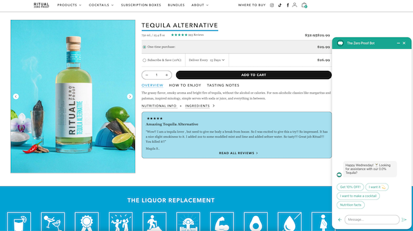
Image Source: Ritual Zero Proof
Ritual Zero Proof includes a live chatbot on each product page that helps shoppers find what they’re looking for and get answers to their questions.
Provide Peace of Mind
Shoppers want a good deal (or at least get what they pay for). Add reassurance with guarantees, safety badges, or any information that proves your product does what it says. These assurances are especially important for products with certain ingredients or high-ticket items.
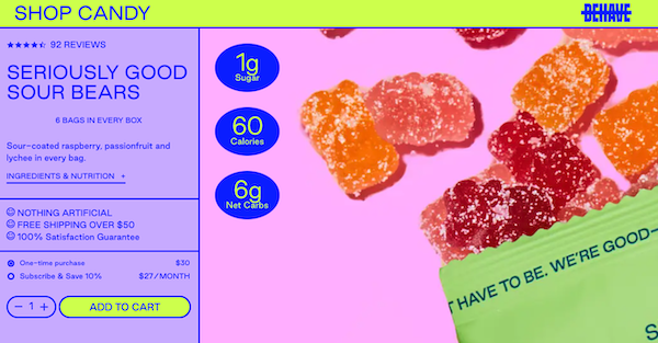
Image Source: Behave
Candy store Behave includes a 100% satisfaction guarantee on its product pages.
Test and Tweak to Consistently Increase Conversion Rates
Your product content strategy will change over time, so it’s necessary to check in regularly to see what’s working and what’s not. Run tests to see what elements impact conversion rates the most, then update your product pages to reflect the changing needs of consumers.
10 Essential Product Page Best Practices (With Examples From Top Brands)
Download Salsify’s guide to discover how to take your product pages from “meh” to amazing.
DOWNLOAD GUIDEWritten by: Lizzie Davey
Lizzie Davey (she/her) is a freelance writer and content strategist for ecommerce software brands. Over the past 10 years, she's worked with top industry brands to bring their vision to life and build optimized and engaging content calendars.
Recent Posts
The Charmification of Commerce: Product Personalization for the Everyday
Research Spotlight: U.K. Consumer Trends and Shopping Habits
How To Bridge the AI Trust Gap Within Your Organization
Subscribe to the Below the Fold Newsletter
Standing out on the digital shelf starts with access to the latest industry content. Subscribe to Below the Fold, our monthly content newsletter, and join other commerce leaders.

.svg)